Modernizing the
Court Experience.
A full visual overhaul leveraging brand blues to create a trustworthy, seamless, and high-performance digital sports platform.

Role
Lead Designer
Objective
UX Simplification
Platform
Mobile Native
Year
2025
Seamless Authentication.
The onboarding flow uses a light, airy interface to ensure maximum readability for a diverse age demographic of players.
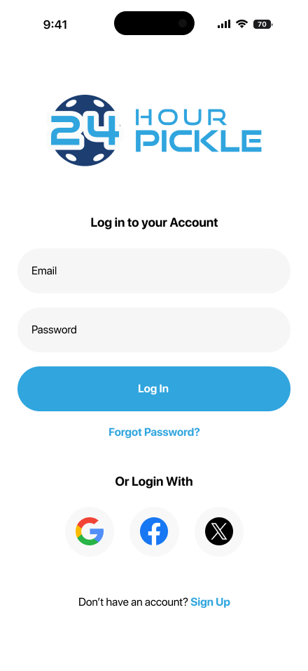
Login
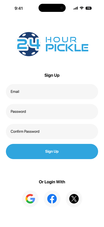
Sign Up
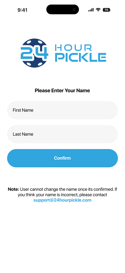
Profile Entry
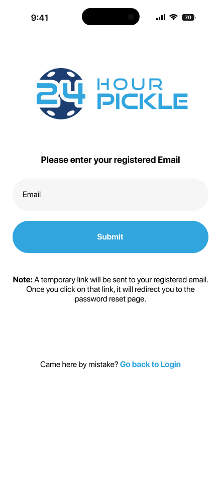
Recovery
The Core Loop.
Optimizing the event discovery journey by putting the most relevant session data front and center.
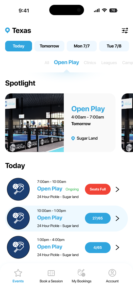
01 Discovery
High-intent filtering and horizontal date scrolling allow players to find court slots and clinics within seconds.
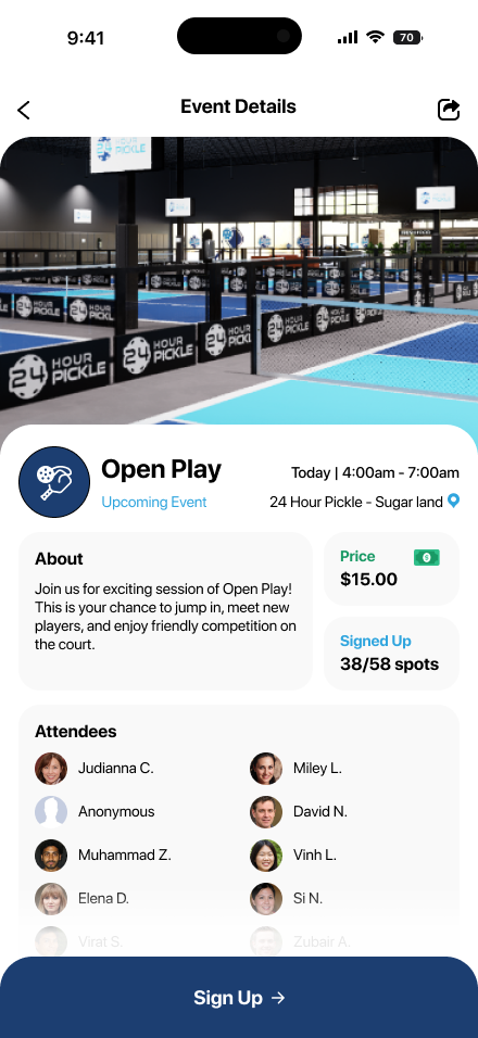
02 Session Details
Leveraging social proof by displaying attendee lists and real-time spot counts to drive community engagement.
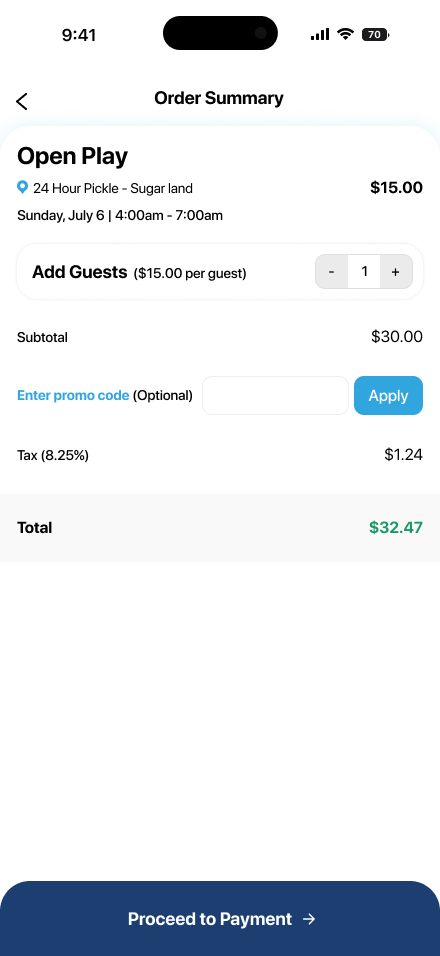
03 Checkout
Streamlined the pricing breakdown and guest addition flow to minimize friction just before final commitment.
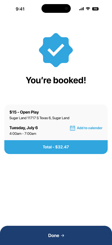
04 Outcome
Clear, satisfying success states provide the user with confirmation and immediate "Add to Calendar" actions.
Secure Wallet.
A focused financial module that simplifies card management while maintaining the athletic brand identity.

Zero State
Minimalist empty state with a clear call-to-action.
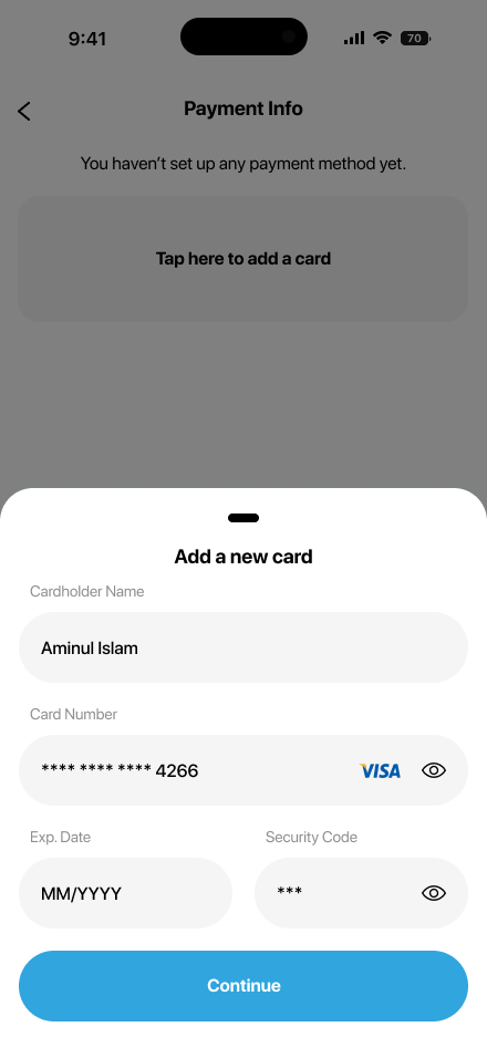
Interaction Design
Utilizing modern bottom sheets for secondary flows.

Brand Consistency
Credit card UI themed in signature Deep Blue.

Visual Strategy
-
Signature Blues
I utilized the high-contrast Sky Blue (#3BAFDA) for primary CTAs and the Deep Blue (#1D427A) for structural elements.
-
High Efficiency UI
Every tap was calculated. By reducing visual noise, we significantly dropped the average time-to-book.
Up Next
Loading...